7 Mistakes Creators Make With Their Link-in-Bio (That Cost Them Money)
Your link in bio is the most clicked URL in your entire online presence. These 7 silent mistakes are leaking money out of it every single day — and every one of them is fixable in under 10 minutes.
If you've ever wondered why a post explodes but the sales don't follow, the answer is almost never the post. It's the link. Your link in bio is the single most clicked URL in your entire online life — and yet it's the one most creators set up once, three years ago, and never touch again. The result: every viral post, every podcast feature, every shoutout pours warm visitors into a leaky bucket.
Below are the 7 mistakes we see kill conversions on creator bio links the most often. None of them are sexy. All of them are fixable in less time than it takes to film a reel. Walk through this list with your own page open in another tab — you'll spot at least three you're guilty of.
Doubling clicks on your bio link is almost always cheaper, faster, and more profitable than doubling your followers. The leverage is hiding in plain sight.
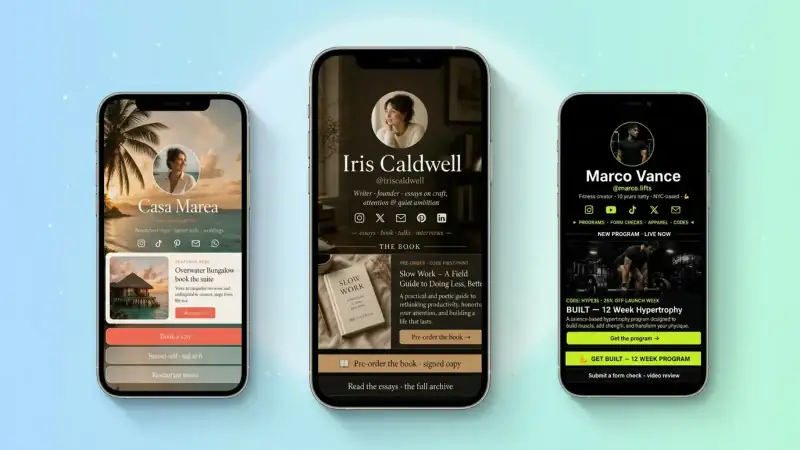
Mistake #1 — Treating it like a sitemap, not a sales floor
The most common bio link looks like a parking lot of every link the creator has ever made: 14 buttons, no hierarchy, no obvious next step. Visitors arrive with one second of attention, see a wall of options, and leave. Pick one primary action this week. Make it bigger, brighter, and at the top. Everything else lives below the fold.
- One bold CTA up top — book, buy, download, join
- A maximum of 5 buttons total — kill the rest
- Style the primary button differently so it visually wins
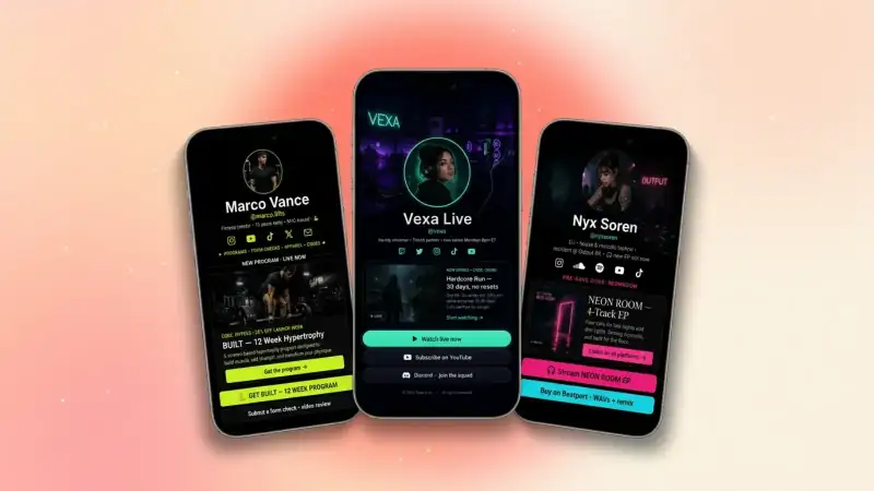
Mistake #2 — Generic, vague button labels
'Click here.' 'My links.' 'Learn more.' These are conversion killers. A button label is a tiny ad. It should tell the visitor exactly what happens after the tap and why they should care. Specific beats clever. Outcome beats name.
Nobody taps a button called 'Services'. They tap 'Book a free 15-min consultation'. Same link, completely different conversion rate.
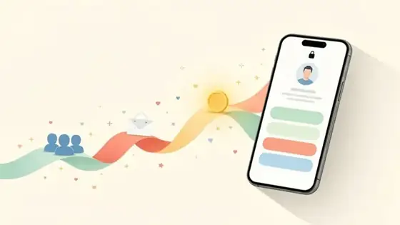
Mistake #3 — No email capture anywhere on the page
Every visitor who leaves without dropping their email is a relationship you have to re-earn from scratch tomorrow. An email signup block on your bio link — paired with a small, useful freebie — turns one-time pageviews into a list you actually own. This is the single highest-ROI fix on this list.
Add an email signup block tied to a 1-page PDF or Notion theme you can make in 20 minutes. Even a 5% capture rate on 1,000 monthly visitors is 50 new owned leads.
Mistake #4 — Sending paid traffic to a generic homepage
If your post is about freelance pricing and your bio link's top button is 'My Etsy shop,' you've broken the chain. Visitors expect the link to match the content that sent them there. Update your top button at least weekly to match what you're posting. Your bio is not a static brochure — it's a live landing page.
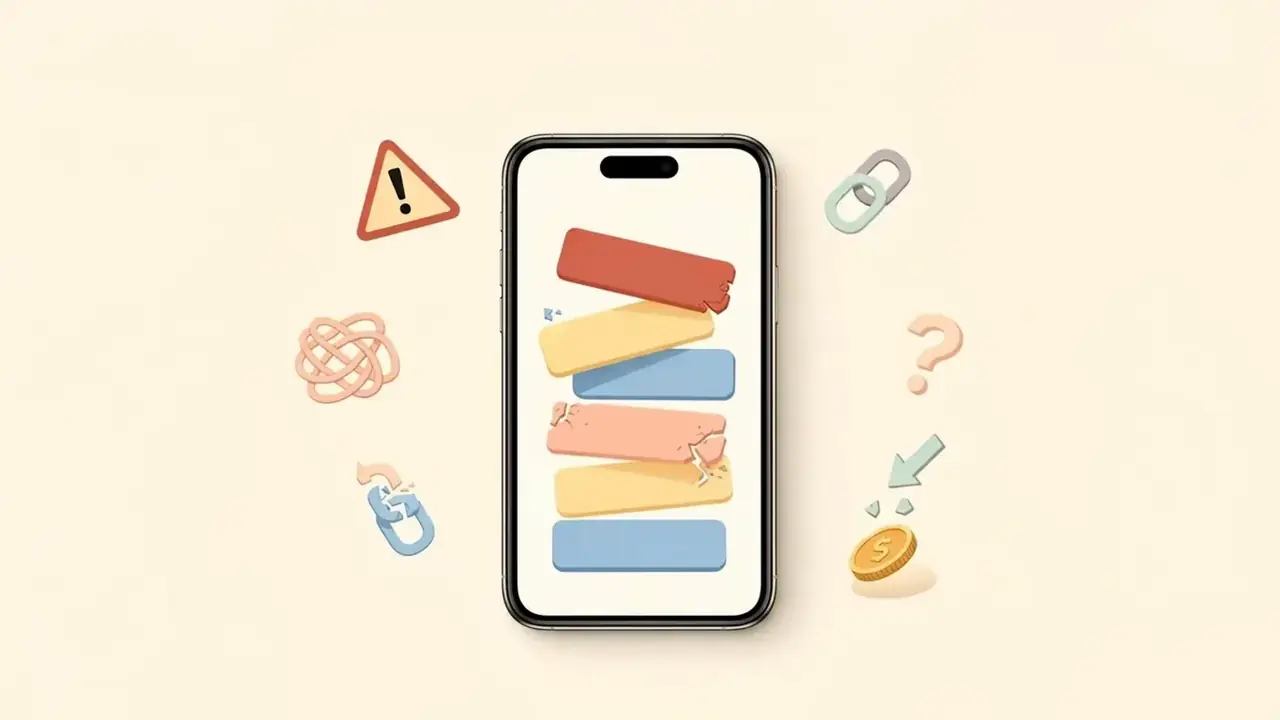
Mistake #5 — Slow, oversized images everywhere
Speed kills conversions more than ugly design ever will. A 4 MB hero image, a giant uncompressed avatar, an autoplay video above the fold — every extra second of load time bleeds 7-10% of your visitors. TinyBio loads instantly by default; don't undo that with heavy media.
- Compress every image under 300 KB before upload
- Use a JPEG or WebP for photos, not PNG
- Limit autoplay videos to one per page, never above the fold
Mistake #6 — No social proof anywhere
Your bio link is where a stranger decides whether to trust you with $0, $50, or $5,000. Strangers don't trust strangers — they trust other strangers' reviews. A single testimonials block with two real, named quotes can lift conversion rates by double digits. Even one client logo or 'Featured in' line counts.
Mistake #7 — Never looking at the analytics
Most creators set up their bio link, post about it once, and never check what's actually happening on it. TinyBio's built-in analytics tell you exactly which buttons get tapped, which posts drive traffic, and which offers convert. Spend 5 minutes every Sunday in the analytics tab. The patterns will tell you exactly what to do more of next week.
- 1Check your top 3 traffic sources — double down on what works
- 2Find buttons with high views but low taps — rewrite the labels
- 3Spot the day with the highest conversions — reverse-engineer the post
Your 10-minute fix-it checklist
- 1Pick ONE primary CTA and move it to the top
- 2Rewrite every vague button with a verb + outcome
- 3Add an email signup block with a real freebie
- 4Match your top button to this week's content theme
- 5Compress every image under 300 KB
- 6Add a testimonial or 'Featured in' block
- 7Bookmark your analytics page and check it every Sunday
Fix these seven things and your bio link stops being a leaky bucket and starts behaving like the high-converting landing page it was always meant to be — without redesigning your brand, switching platforms, or growing your audience by a single follower.
Build a bio link page that converts in under 2 minutes. Email capture, analytics, social proof blocks, and a beautiful design — all free, no credit card.
Build a bio link page that converts
Free, beautiful, fast. Drag, drop, share — your audience does the rest.
Create your TinyBio